 |
| Design Principles - Vijay Thapa |
Design Principles
"The principles of design are the rules a designer must follow to create an effective composition that cleanly delivers a message to their audience, (Reid, 2019)".
Digital principles are not a definitive roadmap from A to B like you would find in a set of standard operating procedures. Instead, they work more like a compass, pointing in the right direction and providing guidance against which you can measure your decisions (Boag, 2019).
Some of the principles of Design that can be implemented on web design, graphic design or any visual design are discussed below.
1. Visual Hierarchy
It’s one of the most important principles of web design, where the different components of web design are ranked based on their importance. And the most important components (forms, call to action, value proposition, etc.) are focused more than rest of the components.The hierarchy may be may come in sizes, colors or font size. For example, Call to Action button like “Add to cart” and “Buy Now” in amazon are more prominent by using colors.
 |
| Call to Action Button in Amazon |
Similarly, the following image of a website shows the different hierarchy ranked by different components.
 |
| Visual Hierarchy in Website Design |
Here, the most important thing is 1 the images of a meat (which attracts the user easily) followed by the title or name of the utensil on large bold font. And the then comes 3 call to action button which encourages users to buy the product, along with 4 the description of the product below the title. And the 5 Free Shipping Banner and 6 the navigation is at the least important section.
In this way, this hierarchy principle can be used in website design to distinguish the importance of different components in a website.
2. Divine Proportions
Divine Proportions also known as The Golden Ratios is a magical number 1.618 (φ – lower case Greek letter phi). And it is believed that the designs that follow this rule are aesthetically pleasing. |
| The Golden Ratio |
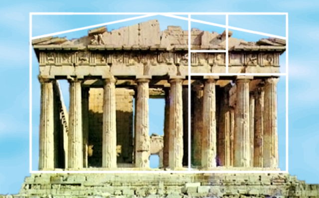
From ancient times, this principle has been utilized to create the masterpiece of arts, like Parthenon (built in Ancient Greece).
 |
| Golden Ratio in Parthenon |
Similarly, this principle can be used in a website design which can make a proportionately crafted and pleasing websites. For example, one of the most popular social networking site Twitter is using the same principle to make a pleasing design.
 |
| Golden Ratio in Twitter |
In website design this principle can be used by following the calculations like if the width of a website is 960 px, then dividing it by 1.618 will give the perfect size for content area which is 593px, and dividing the size of content area by 1.618 is equal 367 px which is the perfect size for sidebar.
Similarly, if the height of website is 7660px then it can be grouped into 470px and 290px groups.
Beside this, the divine proportion principle can be used in typography as well.
3. Hick’s Law
This principle states that the increasing the number of choices increases the time to make the decision.For example, if you’re given a menu containing many items in restaurant, it’ll take much longer to decide which meal to order. But if there’s only two items on a menu then we can decide much faster.
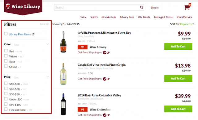
Similarly, in website design, having multiple choices might distract the user and make difficulty in making decision. Thus, better filter options must be used instead of displaying all the products or services. And this will help users to find the product they are looking for and can make the decision quickly as well.
Example of a website with better filter option are as follows
 |
| Hicks Law Implementation in Wine Library Website |
4. Fitt’s Law
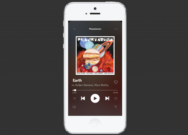
Simply, Fitt’s law states that, “The bigger an object and the closer it is, the easier it is to use”.For example, Spotify makes the play button easier to click than any other buttons. Not only the bigger size, but the position of the button or components also matters.
 |
| Fitts Law in App Design |
But bigger is always not better, a smaller option with a 20% increase in size will get more hits than the bigger button with 20% more increase.
Let’s think of a form which has a “submit” and “reset” buttons at the end. Here, 99.999% people want to hit the submit button as it’s bigger than reset button, according to fitt’s law.
5. Rule of Thirds
This rule of principle is applied on the images that we’ll use in our website. As we know, an image communicates our ideas more easier and faster than text, using images in website is a great choice.According to this law if the image is divided into 9 equal parts, separated by 2 equal horizontal and vertical lines, then the most important part of the image must lie on either of these lines of on the intersection of these lines. It’ll be easier for a user to focus and also looks visually appealing.
 |
| Left- without rule of thirds, Right - With Rule of Thirds |
6. Gestalt Design Law
It is a theory of the mind and brain, founded by Kurt Koffka. And it states that the human eye first sees the whole (complete) picture before seeing the specific parts.And the principle is relatable to the website design as well, because people the see the whole website first before moving the specific parts like navigation, header, footer, etc.
And in order to predict, how users perceive something we need to look at 8 different laws of Gestalt.
7. White Space and Clean Design
In website design, White Space or negative space is a gap between the images, text, margins, etc. that remains empty. It’s not only considered as a blank space, rather it enables objects within in it to exist.When a page is filled of texts or images, it looks clustered and is difficult to read. But the right amount of white space makes the design more clean and pleasant to read and visualize, and also can deliver the message with emotions more clearly.
In this principle, the white space draws more focus on the main message or action.
8. Occam’s Razor
This principle states that the simplest solution is usually the best. It focuses on minimalistic design approach rather than how it looks or works. Though this design approach may not guarantee that the design will work, simple is regarded as the better.Click Here to see some of the websites designed using these design principles.
Design Principles Summarized
Do you use any of these principles on your design?


![Advertisement [ad]](https://blogger.googleusercontent.com/img/a/AVvXsEgVAiCox6-vLXsNZas8ks-nfos0PgdnL4yClmlqOkl92t7zGdYYiLBy9AHMZFxBYe06DVmN6JGQ9S0P3iClXk8l43FIQPDyAcx_uMmV0bN9JlKjTzOAi7YjmQo6cuvHgkEO76L-hcqV-TWE29v93eeFby8MOAOuJ8DcilHTPpfP8aKg8TG9uYCDaMxcr8H1=s600)


Comments